Use the management reports to get a graphical view of how your business is performing. This topic outlines how to use the filters, sort and group the data displayed, and export the data to MS Excel® or export the graph as an image. ![]() NEW 4.8
NEW 4.8
*Synergy Enterprise Feature*
| Who Can Use It? | Where Is It? |
|---|---|
|
|
Reports > Management Reports |
Tips:
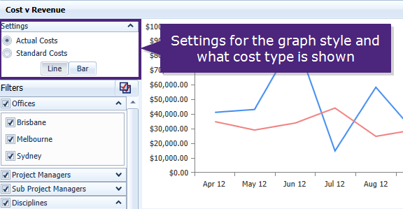
The 'Settings' panel is used to control what style of chart is shown, or what type of cost is displayed in the report. What settings are shown will depend on which Management Report you are viewing. The Settings panel is located in the top left hand corner.
Click the image above to see where the settings panel is located.
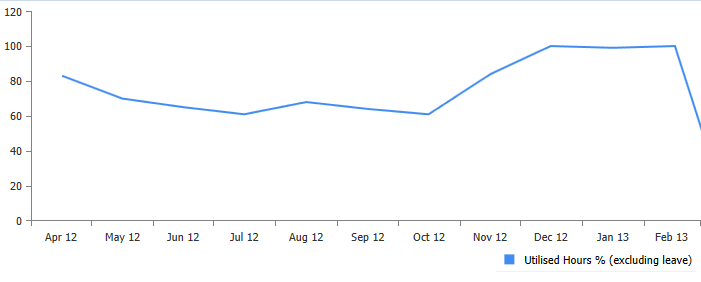
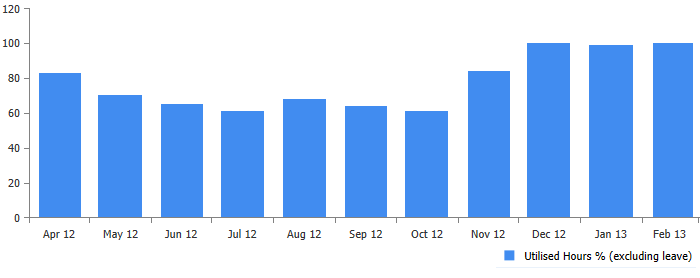
Use the buttons to toggle between viewing a 'Line' chart or a 'Bar' chart.
Click the images above to view samples of the line and bar chart views taken using the Utilised Hours report.
Use the radio buttons to toggle between viewing 'Actual Costs' or 'Standard Costs' in the Chart view and the Data tab. Locate Standard vs Actual Costs for to learn more.
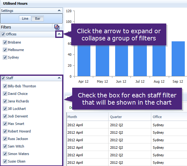
Use the 'Filters' panel to select what data is used to create the graph. This panel is located on the left side of the screen.
 is found next to the 'Filters' heading. This will mark all the filter check boxes as selected, in all the filter groups.
Click on the image above to view the filters panel.
The chart is created using the information shown in the Data tab (the bottom panel). In the Data tab you can sort the columns, group data to view a sum total value for each group, and reorder the columns shown.
You can sort the data by clicking on the column headers.
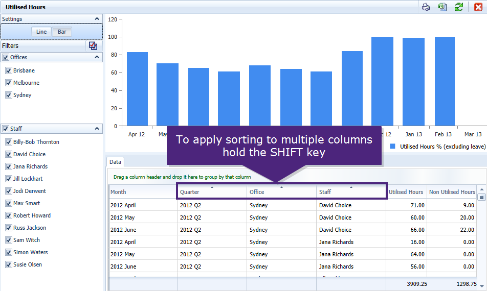
Apply sorting to multiple columns in the list by holding the SHIFT key and click more than one column header. This will then sort the data, in the order that you selected each of the columns.
Click on the image above to view a sample of multiple sorting. Sorted first on staff member, secondly on office.
Need to see all the data for the Project Manager David Choice for the Brisbane office. Select the column 'Staff' then 'Office'. This will sort the data firstly by Staff member, and next by Office Location.
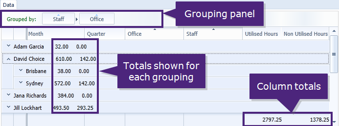
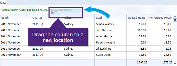
Group the data together in the columns to view totals in the data list, and expand the group to view each data row that was included in the total value.
Click the image above to view the grouping panel.
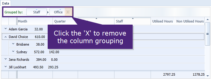
There are two methods to remove columns from the grouping panel:
Click the image above to view how to remove a column from the grouping panel.
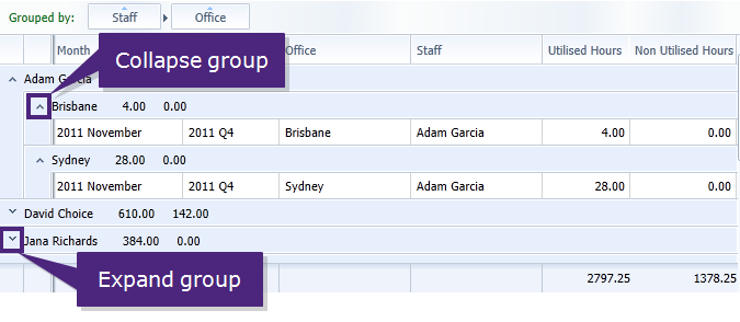
When the data is grouped by several columns, the grouping totals are shown for the first column added. Expand or collapse each grouping to view totals for the next column in the grouping panel, or to see what data rows are contained in the group. Click the down arrow to expand the group, or the up arrow to collapse the group.
Click the image above to view how to expand the grouped column data.
Click the image above to view how to reorder the columns.
Export the report and use the information outside of Synergy with the following methods:
Use this option to create an image file (.PNG) of the graph shown in the top section of the screen.
Click the Print icon ![]() in the top right corner of the report.
in the top right corner of the report.
Choose a location on your computer or the network to save the file.
The image saved will be an exact match for the graph shown on screen.
Use this option to export the information shown in the data list to MS Excel®.
Click the MS Excel® icon ![]() in the top right corner of the report.
in the top right corner of the report.
MS Excel® opens displaying all the information from the data tab.
Edit the information, and save the MS Excel® file as required.
Tip: Made changes to the report data? Update it using the refresh button  in the toolbar.
Looking for more help? Try reviewing the following topics: ![]() View Topics
View Topics
© 2019 Total Synergy Pty Ltd